I have been looking at paint for the rooms in my new house. I will be moving in in mid July and currently having lots of fun with wall colors. I especially have looked at the "2018 Color of the Year" by the various paint companies. I am so excited about changing all those beige walls to something a lot more exciting. My blog is a simplified but very user friendly (OK, IMHO) guide to understanding
and use of color.
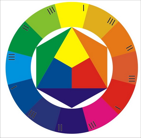
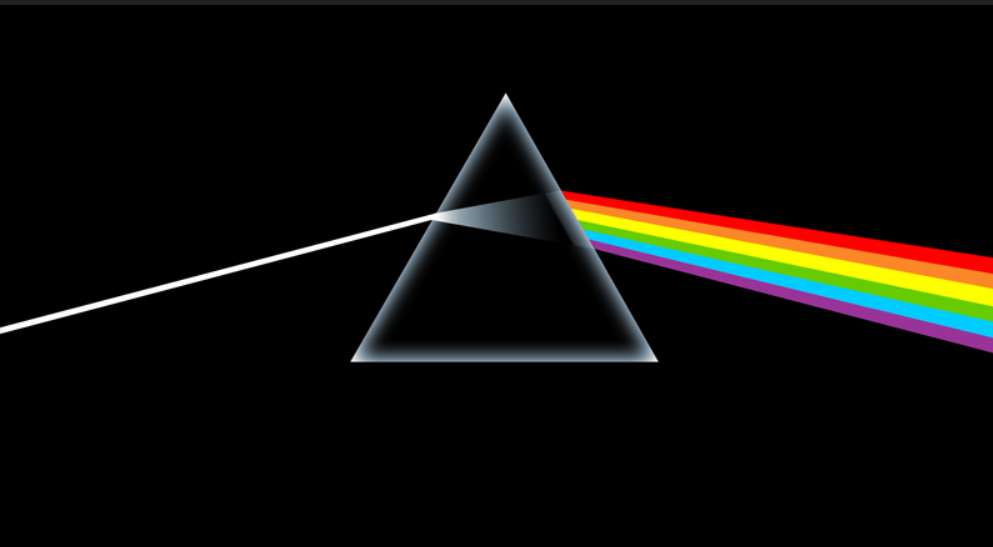
It was Isaac Newton who first define what we know today as a color wheel.
This study must have been incredible with all the basic color and their variations.
Many have tried to discredit his thesis but no one has been successful.
His
findings were that colors, as viewed via a prism show numerous colors.
Conversely, when the colors are gathered together, the result is white.
The basic ‘names’ for the whole world of colors are:
Achromatic – Shades of white, black and greys.
Chromatic – The colors of the (entire) spectrum.
Color Legend:
Primary – These are called primary because you cannot ‘create’ them by
combining other colors. (Shown as Numerals I above) Red, yellow and blue are
the three primary colors.
Secondary – The secondary colors are a mix of two
primary colors. (Shown as Numerals II), and are orange, green and purple.
Tertiary colors are made by mixing two of
the secondary colors (marked “III” in the photo). These are yellow-orange,
red-orange, red-purple, blue-purple, blue-green and yellow-green.
The inner circle represents Primary and Secondary in a more simple
form.
Here are some terms that you will hear and see often and what they actually mean.
Hue – Hue defines a colors' tone; some of those might be "Primary Red - Hue Rose."
Lightness – The shade
of lightness/darkness. You might mix white or black to your color or even a lighter/darker color in the same family. "Black to Charcoal."
Saturation - The
degree of intensity and purity of the color. That box of crayons is a good example of intensity and brilliance of a color. "Pale Yellow - Vibrant Sunshine."
The annual selection of 'color of the year' originates mostly from the paint companies. What better way to sell paint?? Here are a few of the 2018 selections. Frankly, I love them all. I have never been a 'pastel' fan and these are very saturated.
(This is advertised as a black with blue undertones. It is definitely different from black or charcoal.)
You can find Madeira Classic Rayon Thread in these
colors along with their (Hex) number.
Oceanside - #1376 (025B6D)
Caliente - #1447 (8B292A)
Black Magic - #1439 (343533)
What is the bottom line for this blog? Go forth to fill your life and living with color.
INSPIRE YOUR SURROUNDINGS AND ALL WHO ENTER IT.
(I put this in 'cause I thought it was fun!)
Thank you for reading my blog with your busy schedule! Pat