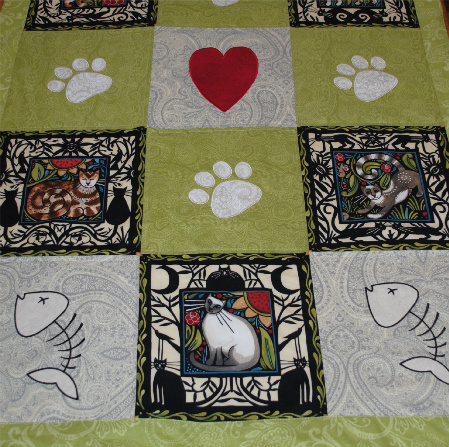
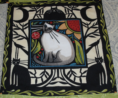
Sometimes, the best side of the fabric is the back. I found that out while making a throw quilt for my daughter. It was based around a Catkin panel by Julie Paschkis. I love her folk/carved block-style approach to her fabric designs. My daughter loves cats so it was perfect.
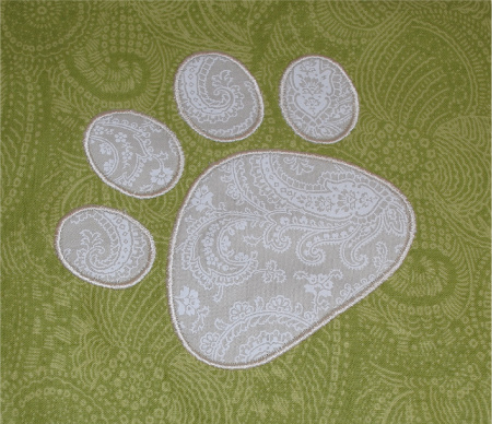
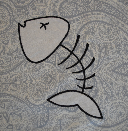
The surrounding blocks were appliqued using tone-on-tone paisley prints (green, grey, and creme), each pulled from colors in the blocks. One used an applique paw print. The other used an applique skeleton fish. In the center, a cream paisley appliqued with a red marbled heart.
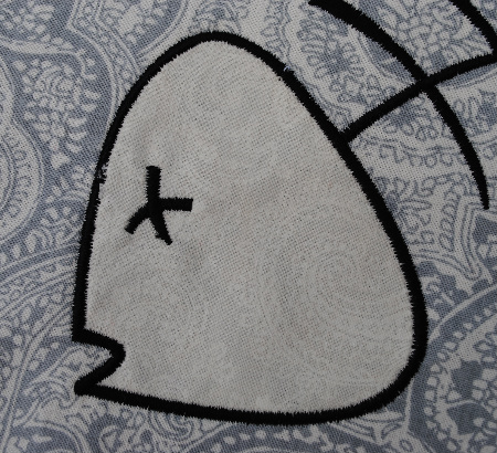
The creme looked wonderful on the green, and great as a background for the heart, but was much too bright when used for the skeleton fish on the grey paisley block.
As often happens with such projects, I'm in the zone, it's 10 p.m. and, even if it were open, the closest fabric store is 20 miles away. While contemplating my dilemma, I played with the cream paisley print, willing it to work with the background. I turned it over and there, on the back, was the perfect, soft, delicate, natural paisley.
Closeup:
(This was a test stich-out, so the satin stitches aren't perfect: I needed to adjust the tension!)
Just when I was feeling pretty ingenious, I was in a local fabric store and overheard the owner telling a customer the very same thing she learned at a conference. A fabric representative told attendees to always turn the fabric over and look at the back. The shop owner took what was otherwise a hideous fabric, turned it over, and it looked like a batik. Shaded fabrics are ideal for applique embroidery, either as a base or as the applique, and it was half-off.
This technique doesn't work with all fabrics, it depends how they are printed, but it is certainly worth a look!
Debbie SewBlest