Because they resemble hand quilting, redwork embroidery designs work great as a quilting motif. Finding the correct amount of contrast (or not) is the key to an embroidery project that pops.
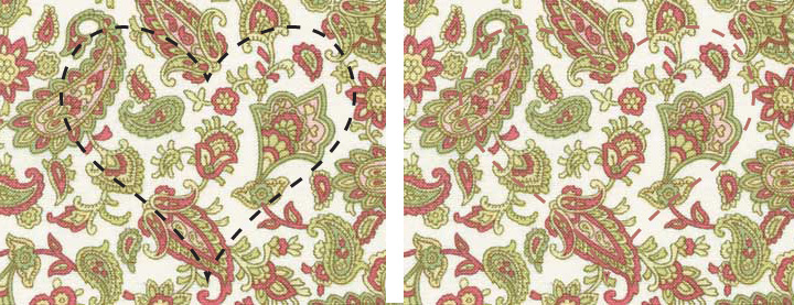
Using a fabric sample called Elm Creek Quilts: Sarah's Collection by Red Rooster, I want to show you how thread color choices affect the outcome of your stitching. Most of the time, we are taught to match thread to the fabric when stitching. Above, black stands out great, but may not be the most desirable color combination. On the right, the medium pink pulled from the paisley matches but it is really hard to see. If the quilt batting was high loft and produced a noticable indentation after stitching, it would be okay.
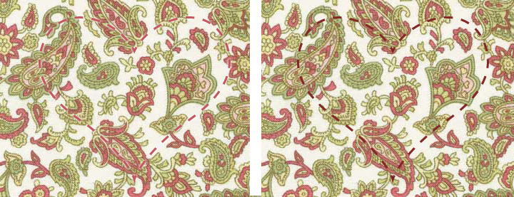
If you want subtle contrast of thread vs. fabric, the example on the left is a good choice since. It also emphasizes the quilting more than the thread. While the pink thread and pink paisley match almost perfectly, the shape of the heart is still hard to distinguish from the background. On the right, using a darker variation of thread, more of a burgundy tone, makes the outline jump off of the fabric without distracting from it.
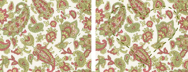
The same is true with green tones. Light green fades into the background, left, while the darker green stands out, right. Although the dark color is not an exact match, it is in the same color family. A flourescent shade of green would not work.
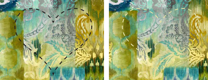
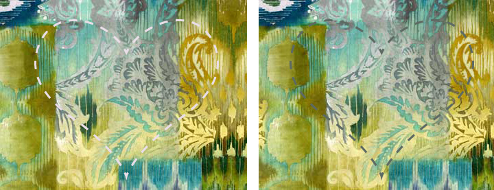
In this fabric, Alexandria by Red Rooster, the color variations are not so definite which makes choosing a quilting thread somewhat more of a challenge. Black is a complete contrast. Cream, on the right, works pretty well except at the bottom of the heart where it gets lost in the lighter area of the background.
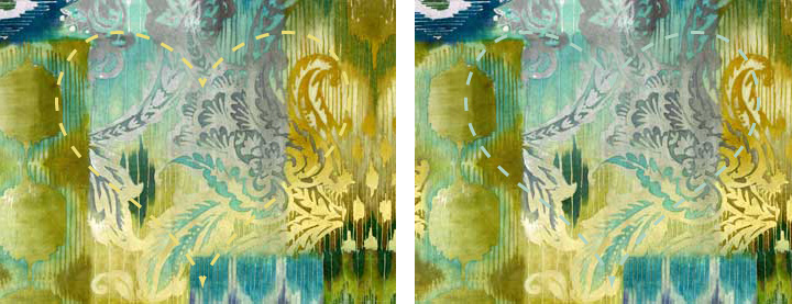
The light yellow and blue hearts also disappear.
Pulling white and dark grey from the background colors works much better, providing separation of stitches from the background around most of each shape.
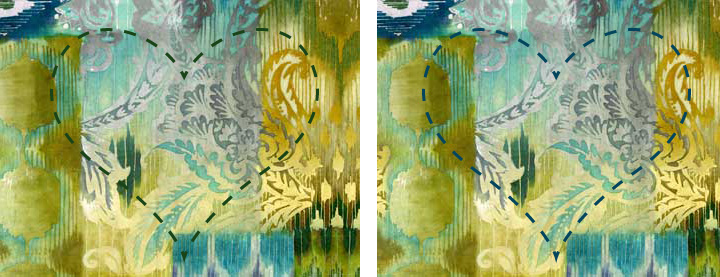
The best contrast happens when using dark green and teal blue threads.
Most of the time, it is a matter of personal preference. Which do you prefer to use in your quilting: subtle or bold?
Debbie SewBlest