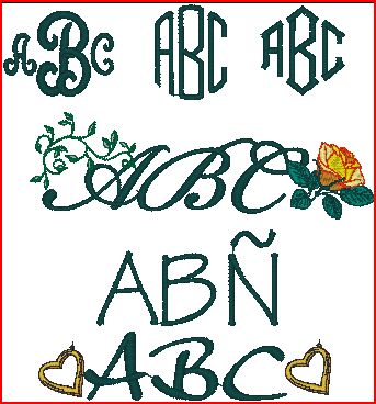
The origins of monograms were very regal. The letters were generally used as a signature and on coins. The artists of the Middle Ages used them to sign their work. Eventually, a monogram became a symbol of one’s place in society.
At one time, rules for monogramming were narrow, and followed the configuration as “ACB” with the center letter being the last name. Today, the more casual use of monogramming has fewer rules and certainly not limited to fabric or coins. To me, nothing is more elegant than a well placed letter on stationery, cuffs, a candle or anything that is not nailed down.
Classic, chic and without an equal, monograms have stood the test of time. Even Laverne could not make a monogram tacky; she wore hers when she was dressed up!
At the risk of being plummeted with non-monogrammed shoes (yes, shoes), I am going to list a few of the ‘rules’ I try to follow:
Rule #1 – there are no rules. . . .
Rule #2 – when the client says they want them upside down, refer to Rule #1.
The Avid Embroiderer’s Rules of Monogramming:
- For Life Partners, I encourage the use of just 2 initials, last names only and the order is their choice. Charles Adams and Sam Brown:

- For those combining both names, I do recommend a hyphen, I personally like them. Charles Adams and Diane Brown:

- For both people with hyphenated last names, I recommend the second letters with a hyphen in the center, and both first names. I think these are falling out of favor. Charles Smith-Adams and Diane Johns-Brown:

- For names with apostrophes, I recommend using just the first initial, i.e., O’Connor would be “O.”
- For names with ‘De’ or ‘La,’ I recommend using ‘D’ or ‘L.’
- For someone wanting something a little different, I recommend a “stack” style where the first and middle are stacked one over the other and the last name a large letter matching the size of the two stacked ones. Adam Bob Carter.

- I personally prefer a single letter. You already knew that!

- I also find two letters, first and last to be a nice combo as well. Anne Adams
- For a really unusual monogram, I would place one letter directly over another. I don’t encourage that because of density issues. Alena Spalding.

- Ken Parson’s Composition has a number of shapes for monograms as well. The fonts include 105 ‘special characters’ such as Õ and Á with some available for monograms.
- The AlphabetXpress has a surprise coming . . . (Whispering: Watch for some new Fonts coming real soon!!! – but keep quiet, it is a secret. . . )
- Whatever the client wants, that is what I will create!

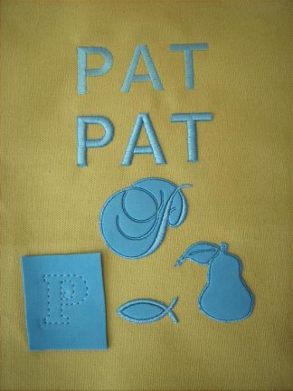
Well, I was anxious to start doing some projects and I had a sheet of ‘foam’ left over from a different project. This foam is similar to the mouse pad that you are using right now. I have washed that mouse pad, so I felt the foam would be suitable for embroidery too.
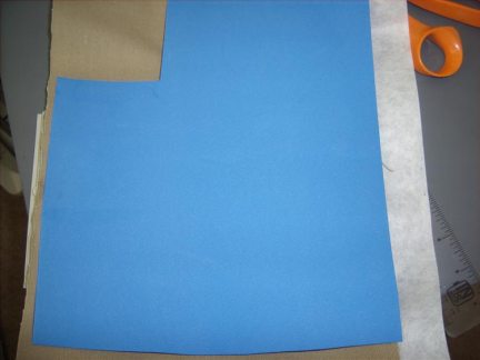
The piece of foam is a 2 mm weight and I am going to use a thread color to match it.
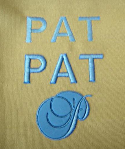
I started off by using a font that had a wide satin stitch. I felt that would be an easy stitch to work with. I created a standard monogram and then I placed the same design atop the foam that was just set on the fabric. I was delighted with the results. I also tried a letter with both satin and running stitches. I left the inside foam but could just as easily have removed it. There is less impact with removing the foam because the monogram "P" only has a small portion with the satin stitch. The more narrow sections is still a satin stitch but too slim to have an effect.
Tip: The foam fell away from the satin stitches, but at the bottom of the letters, you must be careful when you clip the leftover foam. If you clip the threads, you will want to use some “Fray Check” to keep the stitches from coming off.
Tip: If you decide to keep the foam with the design, you may want to have some adhesive to keep it in place. It came right out of the inside of the P and A, so for the Script P, I would have used some glue.
Since these were test sewouts, I was not concerned about perfection.
I played with some other available fonts and outline designs I had and I really like the results. I might even try this on the card paper from Kiwi. . or metallic thread? or under appliqué? or on a towel? or . . . .
I am off to do some more testing, and if you do these, show us the results. Don’t forget, you can upload your photos to "Galleries" for us all to enjoy. I also recommend that you put a little message in the Forum letting us know that it is available.